

App by the author
Nardy — Backgammon & Long Narde
Long Narde and classic backgammon for iPhone. Play a friend or a chatty AI, and on iPhone Duo the fold becomes the bar.
Most SwiftUI views have more than one meaningful state: empty and populated
content, loading, errors, permissions, and edge cases. Those states form a
small visual inventory that we want to review together, but the usual choices
are either a stack of views inside one preview or several nearly identical
#Preview declarations.
Xcode 27 introduces #Preview(arguments:). Pass it a collection of values and
Xcode turns every argument into an independently selectable variant inside one
preview group:
@available(iOS 26.0, *)
#Preview(arguments: DownloadItem.previewItems) { item in
    DownloadCard(item: item)
}
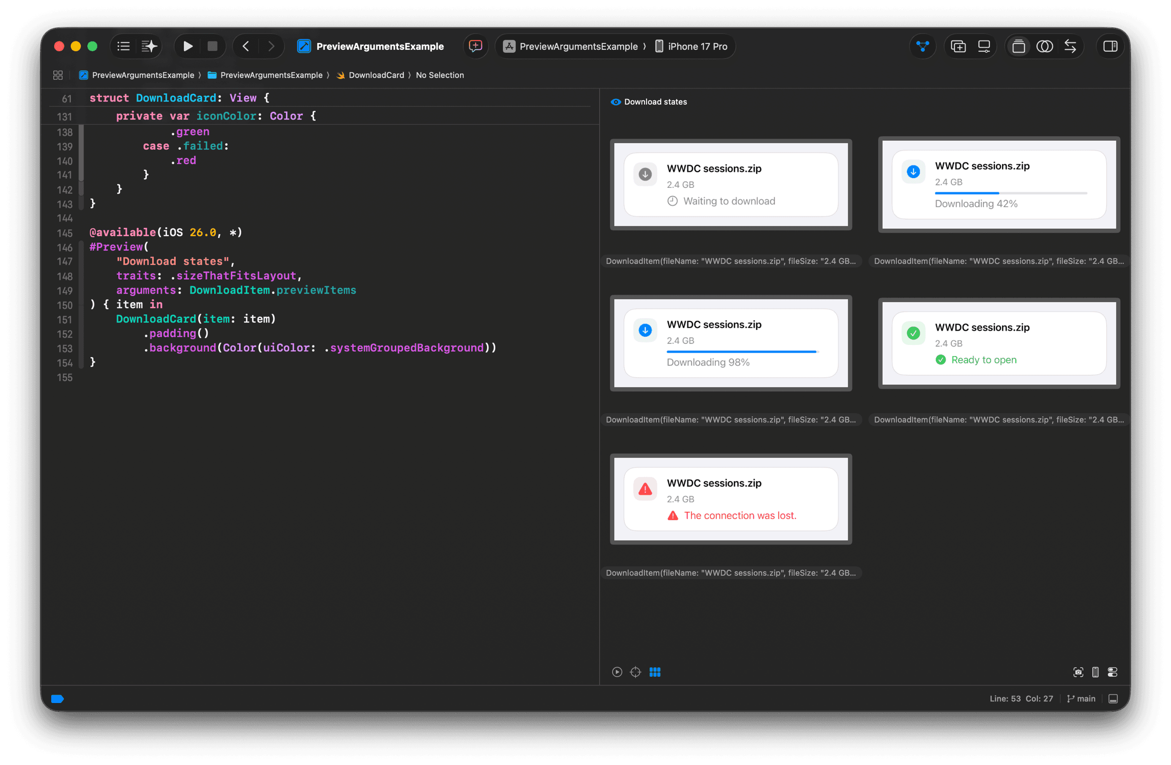
Canvas renders the arguments in a grid and lets you open one variant on its own when you need a closer look.
#Preview(arguments:) requires Xcode 27 and is available on iOS 26, macOS
27, tvOS 26, watchOS 26, and visionOS 26.
Model the view states
The example uses a small download card. Its state lives in a separate
DownloadItem value, so a preview only needs to supply one argument.
enum DownloadState {
    case waiting
    case downloading(progress: Double)
    case completed
    case failed(message: String)
}

struct DownloadItem {
    let fileName: String
    let fileSize: String
    let state: DownloadState
}

struct DownloadCard: View {
    let item: DownloadItem

    // View implementation omitted for clarity.
}
Here is the card in its waiting state:
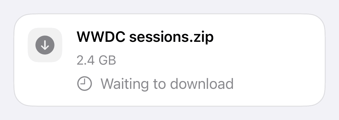
The card layout is not important here, so its implementation is omitted. The complete implementation is available in the example project linked at the end of the article.
Build a preview item catalog
Add the preview items in an extension next to the view or in a preview-only file:
extension DownloadItem {
    static let previewItems: [Self] = [
        .init(
            fileName: "WWDC sessions.zip",
            fileSize: "2.4 GB",
            state: .waiting
        ),
        .init(
            fileName: "WWDC sessions.zip",
            fileSize: "2.4 GB",
            state: .downloading(progress: 0.42)
        ),
        .init(
            fileName: "WWDC sessions.zip",
            fileSize: "2.4 GB",
            state: .downloading(progress: 0.98)
        ),
        .init(
            fileName: "WWDC sessions.zip",
            fileSize: "2.4 GB",
            state: .completed
        ),
        .init(
            fileName: "WWDC sessions.zip",
            fileSize: "2.4 GB",
            state: .failed(message: "The connection was lost.")
        ),
    ]
}
Declare one preview per state
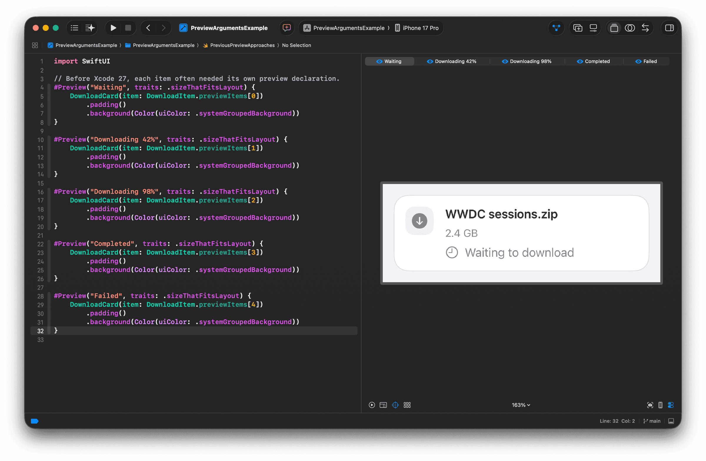
The most direct approach is a separate #Preview declaration for every
state:
#Preview("Waiting", traits: .sizeThatFitsLayout) {
    DownloadCard(item: DownloadItem.previewItems[0])
}

#Preview("Downloading 42%", traits: .sizeThatFitsLayout) {
    DownloadCard(item: DownloadItem.previewItems[1])
}

#Preview("Downloading 98%", traits: .sizeThatFitsLayout) {
    DownloadCard(item: DownloadItem.previewItems[2])
}

#Preview("Completed", traits: .sizeThatFitsLayout) {
    DownloadCard(item: DownloadItem.previewItems[3])
}

#Preview("Failed", traits: .sizeThatFitsLayout) {
    DownloadCard(item: DownloadItem.previewItems[4])
}
This keeps each state independent, but repeats the preview setup. Canvas shows the declarations as separate previews, so reviewing the component means switching between states instead of seeing them together. Adding a state also means adding another declaration and keeping its name and value in sync.
Put every state in one preview
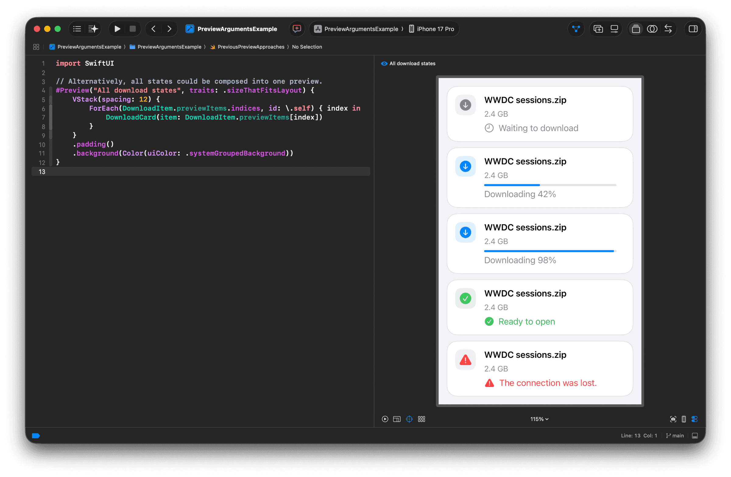
To see everything at once, put the items in a VStack:
#Preview("All download states", traits: .sizeThatFitsLayout) {
    VStack(spacing: 12) {
        ForEach(DownloadItem.previewItems.indices, id: \.self) { index in
            DownloadCard(item: DownloadItem.previewItems[index])
        }
    }
    .padding()
    .background(Color(uiColor: .systemGroupedBackground))
}
This is useful for a quick visual comparison, but Canvas still sees one preview. The individual cards are subviews of a single vertical layout, not preview variants. That makes it harder to open one state on its own or to use the Canvas grid as an inventory of component states.
Generate variants with #Preview(arguments:)
The new macro takes the array and a closure that receives one element:
@available(iOS 26.0, *)
#Preview(
    "Download states",
    traits: .sizeThatFitsLayout,
    arguments: DownloadItem.previewItems
) { item in
    DownloadCard(item: item)
        .padding()
        .background(Color(uiColor: .systemGroupedBackground))
}
The API accepts [T], so an enum, a model, or a dedicated scenario type all
work. It does not require Identifiable, Hashable, Equatable, or
CaseIterable.
The first string names the preview group. Canvas renders a grid containing the five arguments instead of treating them as subviews of one large preview. The array order determines the order in which we review the states. Without custom labels, Xcode falls back to each value's default description, which is too long to distinguish the variants at a glance.
Name each Canvas variant
To customize a variant's name in Canvas, make the argument type conform to
CustomStringConvertible and return the label from description:
extension DownloadItem: CustomStringConvertible {
    var description: String {
        switch state {
        case .waiting:
            "Waiting"
        case let .downloading(progress):
            "Downloading \(progress.formatted(.percent.precision(
                .fractionLength(0))))"
        case .completed:
            "Completed"
        case .failed:
            "Failed"
        }
    }
}
Two variants both labeled Downloading would be indistinguishable in the
grid, so labels should be short, stable, and unique within the group.
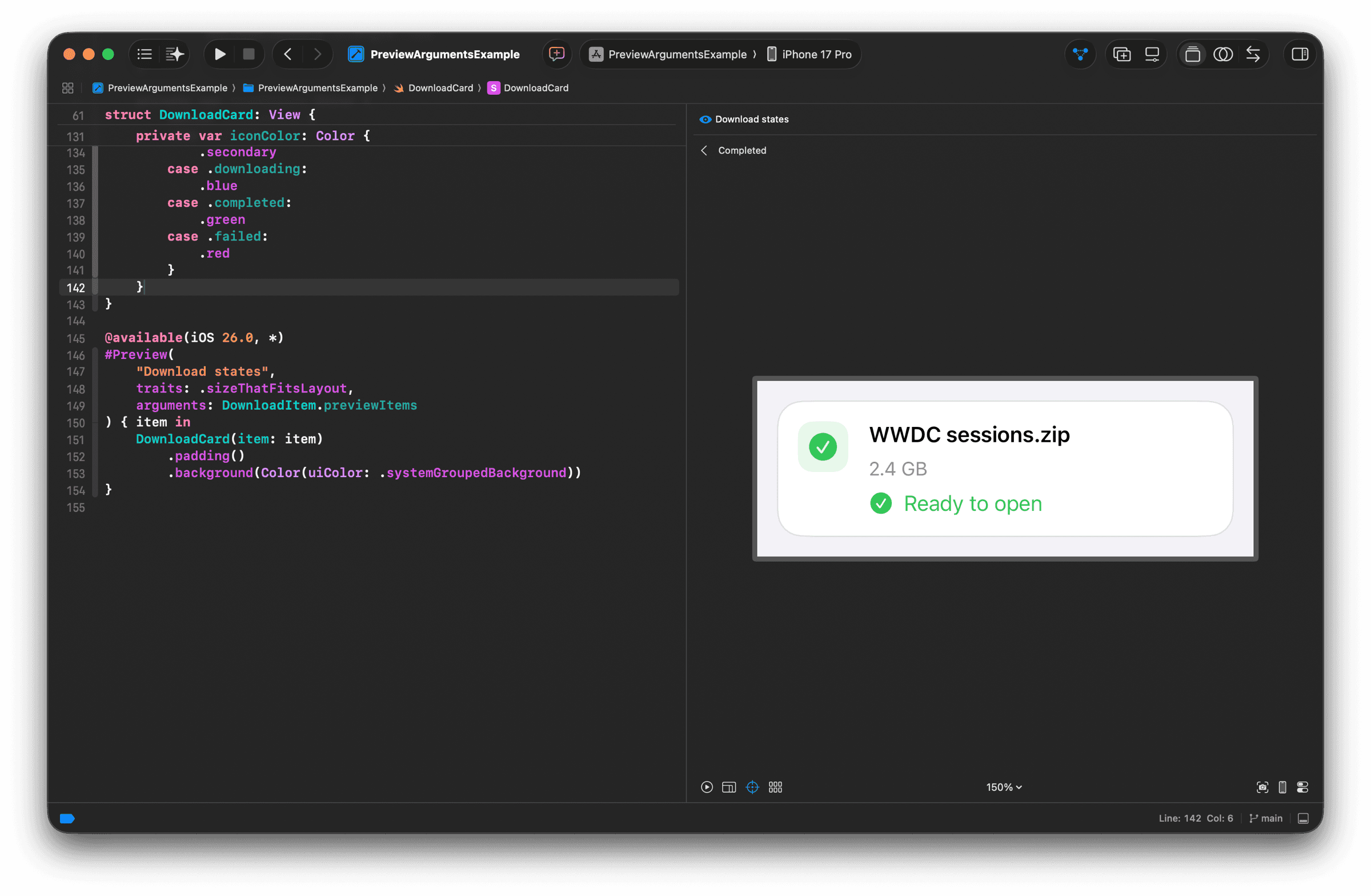
Click a variant in the grid and Xcode opens that item on its own. You can inspect it at a comfortable size without losing the context of the state that created it. If the view contains controls, the same variant can be opened in Interactive mode.
Use arguments for states, not environments
Use arguments for one finite axis of meaningful input states, the same list the card started with plus a few carefully chosen edge cases. A long file name, a large value, or a localized error earns a slot when it reveals a layout problem.
Keep environment concerns separate. Color schemes, Dynamic Type sizes, locales, devices, and orientations are better expressed with preview traits or additional preview groups. Otherwise a small state catalog quickly becomes a large matrix that is difficult to scan.
Arguments describe the initial input for a variant; they do not replace local
mutable state. Use @Previewable or a small wrapper view when an interaction
needs to change bindings or observable models.
Keep an iOS 17 deployment target
The app does not need to raise its deployment target to iOS 26. Keep the
existing target and mark only the new preview with @available(iOS 26.0, *).
You can inspect the generated code in Xcode by Control-clicking the preview declaration and choosing Expand Macro. The expansion shows that the preview registry uses the older infrastructure, available from iOS 17, and guards the new overload at runtime:
@available(iOS 17.0, macOS 14.0, tvOS 17.0, visionOS 1.0, watchOS 10.0, *)
nonisolated struct $s23PreviewArgumentsExample0023DownloadCardswift_elFCffMX145_0_33_ABA51F1A69BAC7119FC7A1DC29AA9D8ELl0A0fMf_15PreviewRegistryfMu_: DeveloperToolsSupport.PreviewRegistry {
    static var fileID: String {
        "PreviewArgumentsExample/DownloadCard.swift"
    }
    static var line: Int {
        146
    }
    static var column: Int {
        1
    }

    @MainActor static func makePreview() throws -> DeveloperToolsSupport.Preview {
        if #available(iOS 26.0, *) {
            DeveloperToolsSupport.Preview(
                "Download states",
                traits: .sizeThatFitsLayout,
                arguments: DownloadItem.previewItems
            ) { item in
                DownloadCard(item: item)
                    .padding()
                    .background(Color(uiColor: .systemGroupedBackground))
            }
        } else {
            throw DeveloperToolsSupport.PreviewUnavailable()
        }
    }
}
The source-location metadata and generated type name are implementation
details. The @available(iOS 17.0, ...) on the registry does not make
arguments: available on iOS 17–26; the inner if #available(iOS 26.0, *)
throws PreviewUnavailable() there instead. The annotation on #Preview lets
an application with a lower deployment target compile cleanly.
Example project
You can explore the complete implementation in the PreviewArgumentsExample project.
For an example of applying the same mindset to intermediate generated content, see Working with partially generated content in Xcode previews.