Sponsored
Glaze by Raycast
Desktop apps, reimagined by you. Create software for you and your team — it lives on your Mac and connects to your files, tools, and hardware.
Learn More →In a previous post we drew Github contribution graph with Swift Charts. It is a powerful framework that lets you visualize data in various ways. In the Swift Charts: Vectorized and function plots WWDC session I came across an interesting example: drawing maps.
I was inspired by this example and decided to draw a different map. I live in Kazakhstan, so let's visualize population data of Kazakhstan regions. Here's a reference chart from an official statistics site:
 Source: gov.kz
Getting data
Initially, we need to get information about region coordinates, names and population. The best format for it is GeoJSON — an open standard format designed for representing simple geographical features. I used overpass turbo service to retrieve relevant coordinates and information. You can use a special query language to get data. Here's a query to get all regions of Kazakhstan:
[out:json];
{{geocodeArea:Kazakhstan}}->.searchArea;
relation["admin_level"="4"](area.searchArea);
out geom;
As a result you will get a JSON file with all regions of Kazakhstan in a special format. I modified it slightly, removed cities to simplify the drawing, and updated the population with actual values.
To process this file, we can use MKGeoJSONDecoder from MapKit framework. It allows to decode GeoJSON data into a collection of MKGeoJSONFeature objects.
import MapKit

func loadFeatureData() throws -> [FeatureData] {
    let url = Bundle.main.url(forResource: "kazakhstan",
                              withExtension: "geojson")!
    let kazakhstanData = try Data(contentsOf: url)
    let features = try MKGeoJSONDecoder()
        .decode(kazakhstanData)
        .compactMap { geoJSONObject in
            if let feature = geoJSONObject as? MKGeoJSONFeature {
                return FeatureData(feature: feature)
            }
            return nil
        }
    return features
}
Additionally, we need to create FeatureData struct to get information about each region. Apple engineers recommend preparing all data before drawing charts to prevent performance issues.
import MapKit

struct FeatureData: Identifiable {

    let id: String
    let coordinates: [CLLocationCoordinate2D]
    let center: CLLocationCoordinate2D
    let name: String?
    var population: Int = 0

    init?(feature: MKGeoJSONFeature) {
        guard let properties = feature.properties,
              let polygon = feature.geometry.first as? MKPolygon else {
            return nil
        }
        id = feature.identifier ?? UUID().uuidString
        coordinates = polygon.coordinates
        center = polygon.center
        let propertiesData = try? JSONDecoder().decode([String: String].self, from: properties)
        name = propertiesData?["name:en"]
        if let rawPopulation = propertiesData?["population"], let population = Int(rawPopulation) {
            self.population = population
        }
    }
}
In our case, all features contain only one geometry object — MKPolygon. With a small extension, we can extract all coordinates and determine the center of the region:
extension MKPolygon {

    var coordinates: [CLLocationCoordinate2D] {
        var coordinates = [CLLocationCoordinate2D](repeating: kCLLocationCoordinate2DInvalid,
                                                   count: pointCount)
        getCoordinates(&coordinates, range: NSRange(location: 0, length: pointCount))
        return coordinates
    }

    /// The center calculation algorithm is simple and may not work for regions with complex shapes.
    var center: CLLocationCoordinate2D {
        var minLat = CLLocationDegrees.greatestFiniteMagnitude
        var minLng = CLLocationDegrees.greatestFiniteMagnitude
        var maxLat = -CLLocationDegrees.greatestFiniteMagnitude
        var maxLng = -CLLocationDegrees.greatestFiniteMagnitude

        for coordinate in coordinates {
            minLat = min(minLat, coordinate.latitude)
            minLng = min(minLng, coordinate.longitude)
            maxLat = max(maxLat, coordinate.latitude)
            maxLng = max(maxLng, coordinate.longitude)
        }
        return CLLocationCoordinate2D(latitude: (minLat + maxLat) / 2,
                                      longitude: (minLng + maxLng) / 2)
    }
}
We also use feature.properties to retrieve the name and population of the region. Now we can draw a chart with map data.
Drawing chart
Let's prepare a content view:
import SwiftUI
import Charts
import MapKit

struct ContentView: View {

    @State private var features: [FeatureData] = []

    var body: some View {
        Chart {
            // Chart code goes here
        }
        .onAppear {
            do {
                features = try loadFeatureData()
            } catch {
                print("Error parsing GeoJSON: \(error)")
            }
        }
    }
}
To mimic the reference chart, we'll draw different components:
- Colored areas with
AreaPlot; - White lines with
LinePlot; - Points with
PointMark.
AreaPlot and LinePlot are available since iOS 18. If you're using an older version, you can use AreaMark and LineMark instead.
For each component we create a separate ChartContent view to decompose drawing logic. Let's start with colored areas:
import Charts

struct FeatureAreaPlot: ChartContent {

    let featureData: FeatureData

    var body: some ChartContent {
        AreaPlot(featureData.coordinates,
                 x: .value("Longitude", \.longitude),
                 y: .value("Latitude", \.latitude),
                 stacking: .unstacked)
        .foregroundStyle(by: .value("Population", featureData.population))
    }
}
We set x and y values as PlottableValue with key paths to CLLocationCoordinate2D properties. Also we set a stacking parameter to unstacked to draw each region separately. To set a color we use foregroundStyle(by:) modifier with a PlottableValue for population. Let's add these views to the chart:
Chart {
    ForEach(features) { featureData in
        FeatureAreaPlot(featureData: featureData)
    }
}
.chartYScale(domain: 40...56)
.chartXScale(domain: 40...95)
.chartXAxis(.hidden)
.chartYAxis(.hidden)
.chartLegend(.hidden)
.chartPlotStyle {
    $0.aspectRatio(2, contentMode: .fit)
}
Additionally we change scales to center our map, hides unnecessary axes and legend, and set a fixed aspect ratio. Here's a result:
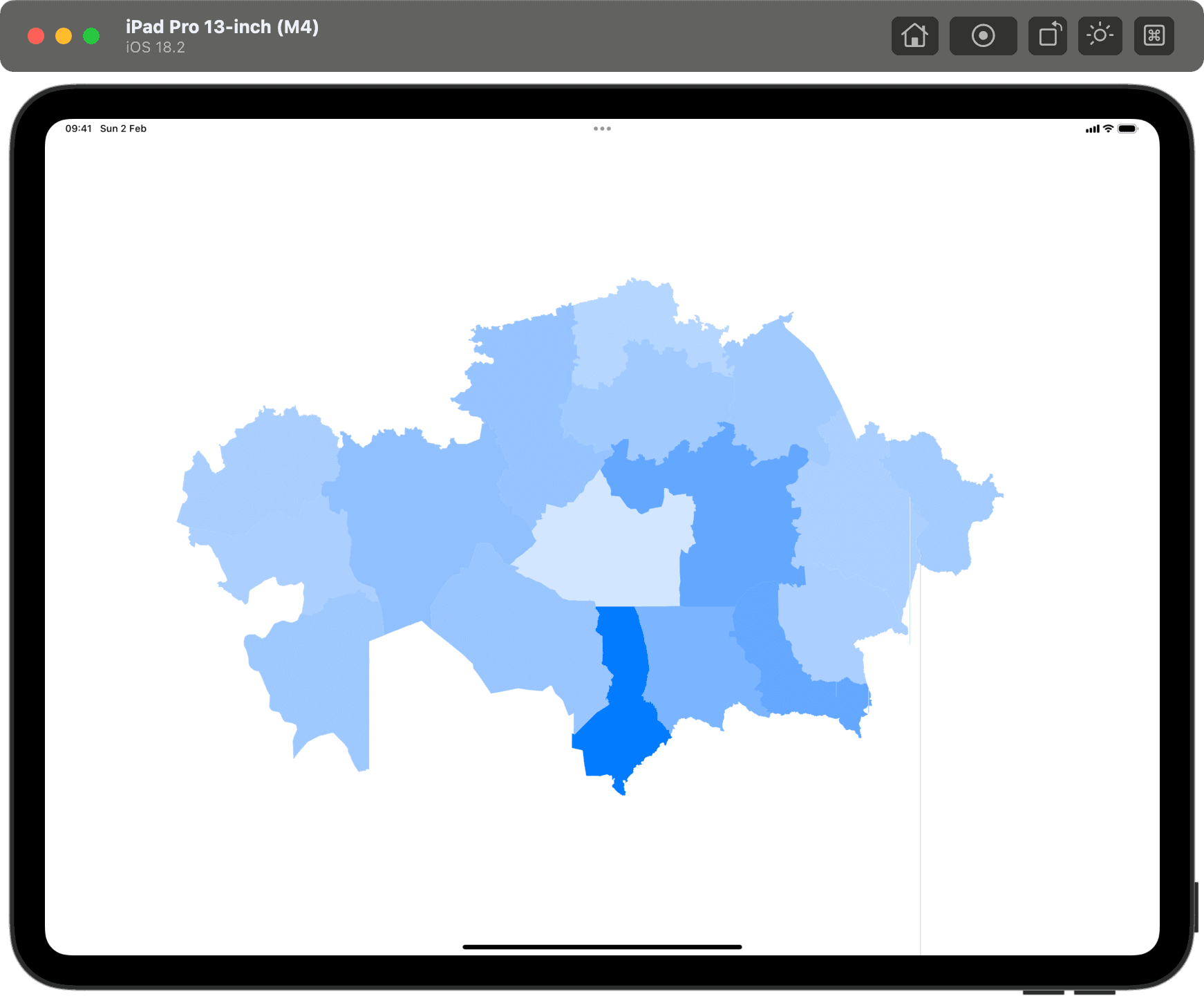
You may notice strange artifacts in the drawing — two lines at the right. As I understood during debugging, different areas somehow affect each other. I didn't find a solution to fix it, but I'm almost sure it depends on the coordinates. But it's hard to find a mistake in such a big dataset.
The next part is to draw white lines. We can use LinePlot for this:
import Charts

struct FeatureLinePlot: ChartContent {

    let featureData: FeatureData

    var body: some ChartContent {
        LinePlot(featureData.coordinates,
                 x: .value("Longitude", \.longitude),
                 y: .value("Latitude", \.latitude)
        )
        .lineStyle(.init(lineWidth: 1, lineCap: .round, lineJoin: .round))
        .foregroundStyle(by: .value("Feature", featureData.id))
    }
}
The code looks similar to the previous one. We use LinePlot to draw a line with a specified line style. Foreground style prevents the line from being connected for a separate regions. Let's add this view to the chart:
Chart {
    ForEach(features) { featureData in
        FeatureAreaPlot(featureData: featureData)
    }
    ForEach(features) { featureData in
        FeatureLinePlot(featureData: featureData)
    }
}
We split the marks into two parts to draw lines above the areas. Since iOS 17 you can use zIndex modifier for each mark to control the order of drawing. However, it doesn't work in this case. If you know how to fix it, feel free to share your solution on X.
Now we have a map with colored areas and white lines:

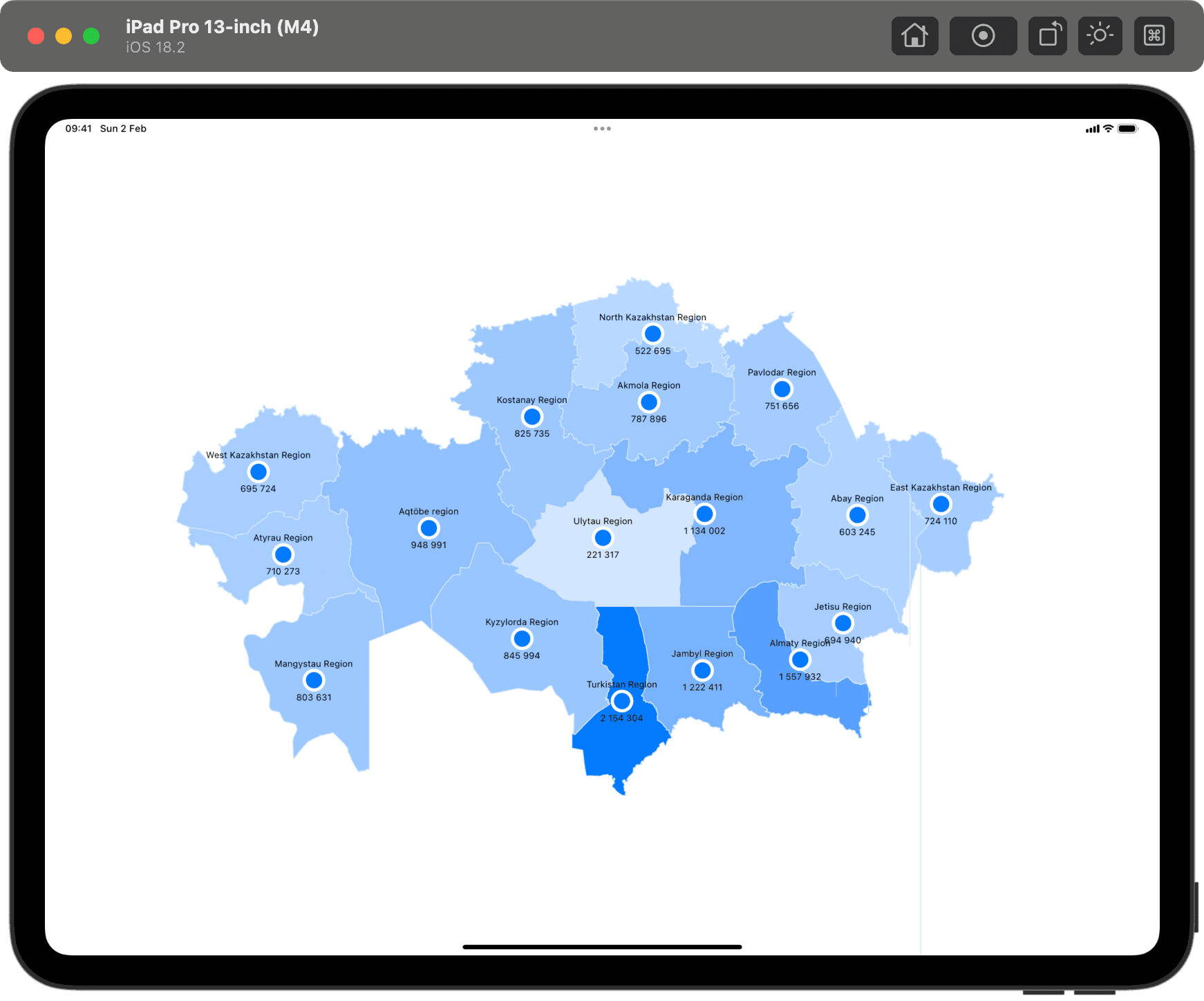
The last part is to draw points. We can use PointMark for this:
import SwiftUI
import Charts

struct FeaturePointMark: ChartContent {

    let featureData: FeatureData

    var body: some ChartContent {
        PointMark(x: .value("x", featureData.center.longitude),
                  y: .value("y", featureData.center.latitude))
        .symbol {
            Circle()
                .stroke(.white, lineWidth: 8)
                .fill(.blue)
                .frame(width: 20, height: 20)

        }
        .annotation(position: .top, alignment: .center, spacing: 4) {
            if let name = featureData.name {
                Text(name)
                    .font(.caption2)
            }
        }
        .annotation(position: .bottom, alignment: .center, spacing: 4) {
            Text(featureData.population, format: .number)
                .font(.caption2)
        }
    }
}
Here we use three modifiers for customization:
symbolto set a custom view for the point;annotationto add a top text with the region name;annotationto add a bottom text with the population.
Adding to the chart is similar to the previous steps, so let's check the result:
Conclusion
In this post we learned how to draw maps with Swift Charts. The final result is not perfect, but I discovered a lot of interesting and unobvious cases that can be useful in the future. Swift Charts has a lot of potential. Charts can be interactive; we can enhance the example above and add a region selection. Moreover, Swift Charts supports accessibility, and we can add VoiceOver to make the map more accessible.
I hope you enjoyed this example and will try to draw your own maps. As usual, you can find the final project on Github. If you have any questions or suggestions, feel free to share them on X. Thanks for reading!